
Hello Everyone!!
This is Tushar...
This is Tushar...
Today, I am going to tell you how to develop a custom button of your own design in WPF. You just follow the steps as :
·
1. Open an existing WPF application or create a new
one. Add a new window (e.g. MYWindow) to your project.
 | |
| Adding lable as Button element |
 | |
| Selecting shape from toolbox |
 | |
| Drawing an ellipse |
 | |
| Make Button... Menu |
·
4. Now, a
Create Style resource window is opened. Give the specific Name to your button
style. Let’s give the name e.g. btnCloseStyle
since we intend to create the Close button and Press OK.Here our desired element is changed into a button.
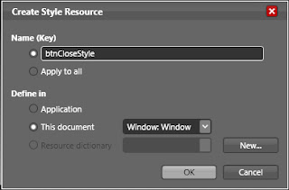 | |
| Creating Style Resource |
 | |
| Renaming Button |
 |
| Editing Control Part |
 | |
| Creating event for Button click |
·
Inside event handler method, we can write the
logic which should get executed after clicking the button we created. Here we
are closing the window when we click on Close button.
Inside Visual studio editor, we write the
code as:
private void btnClose_Click(object
sender, RoutedEventArgs e)
{
this.Close();
}
· 8. Now we’ll create and apply style to button we
created so as to configure its triggers when mouse pointer is hovered over it or
it is mouse clicked. Now right click on button element in Object and Timeline
section and select Edit Control Part (Template)
and select Edit Template. Now look
in Interaction section’s Triggers section.
You can see events related to buttons. You click on any trigger and change the
corresponding properties of the elements. Well set triggers of the button as:
1.
Default
 | |
| Editing Triggers for button |
2.
When Mouse Over
We set here the triggers for the button when mouse curser is hover over
the button. Here we set ellipse as well as label element’s opacity to 100%.
3.
When Button is pressed.
We set here the behavior for the button when button is pressed. Here we
change the color of button to more dark shade so as to make the button fee like
pressed.
·
9. You can also assign ToolTip to your button so as
to guide the user to make understand about the use of button. In Properties section
of the window, add ToolTip for the button.
 |
| Adding ToolTip for Button |
·
10. Now go to Project tab and right click on
solution’s icon and click on Test Solution. Now a window is shown to you with
the button we made for closing the window.
·
Hover
mouse over it you can see the changes taking place in the behavior of the
button. If You clicked on the button and kept it in pressed condition, you see
the button color is darken. And when you leave button pressed and its clicked
event is fired and you observe that the window is closed.
 |
| Final Output |
Happy Coding :)
No comments:
Post a Comment